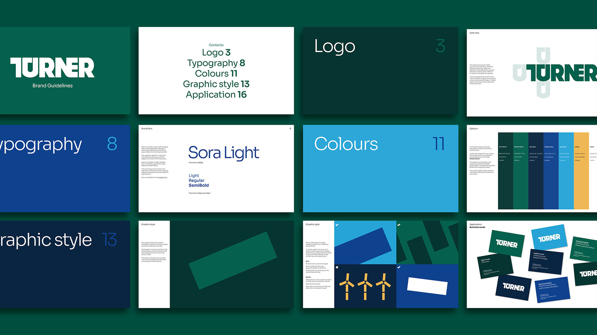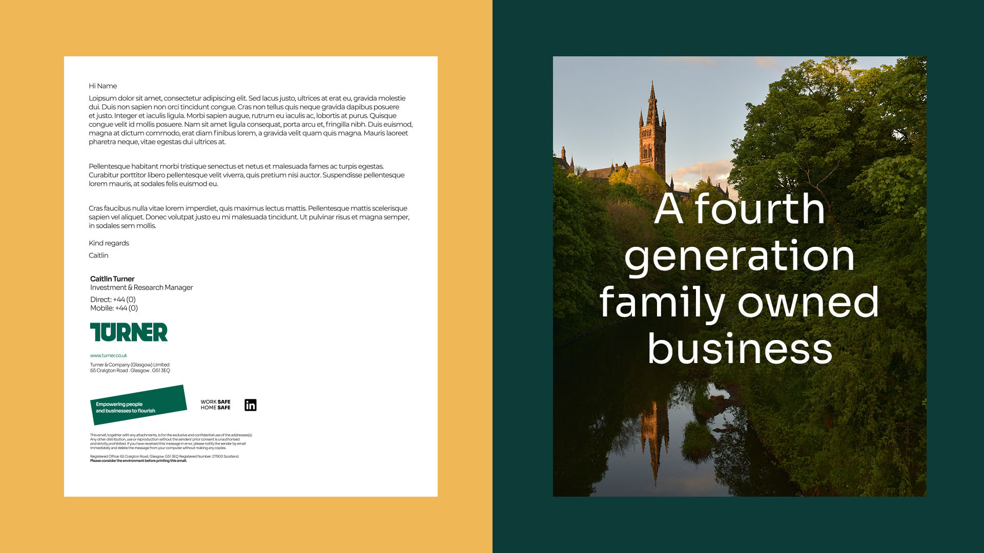
Turner & Co is a fourth-generation family business that's been building private companies for more than 100 years. During a pivotal time for their business, a brand refresh was key to conveying their vision of future forward entrepreneurship and being purpose-driven.
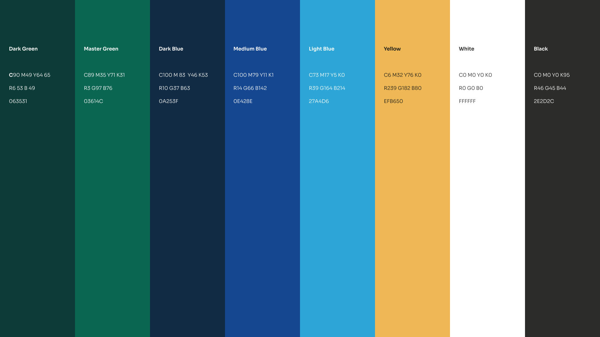
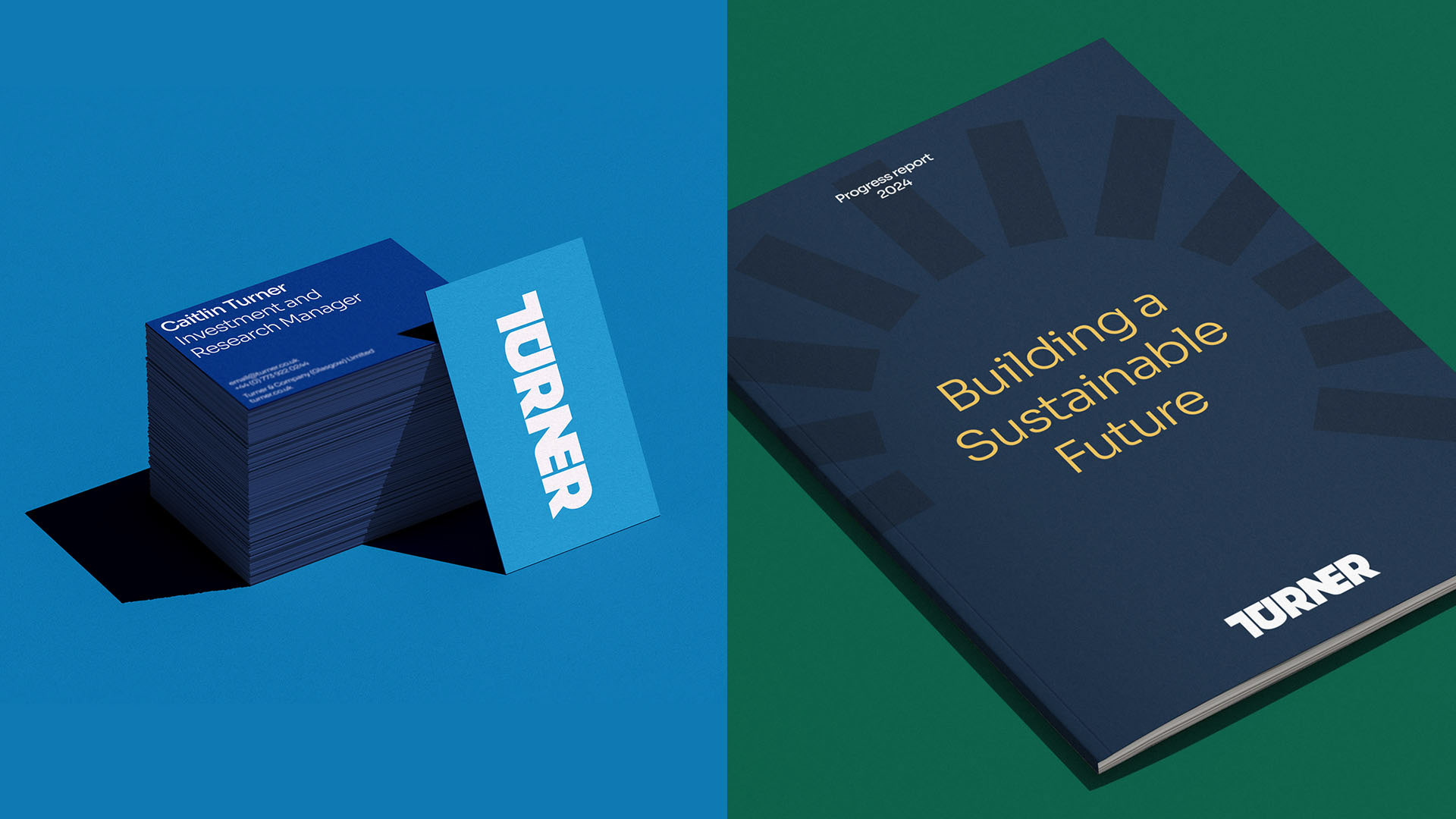
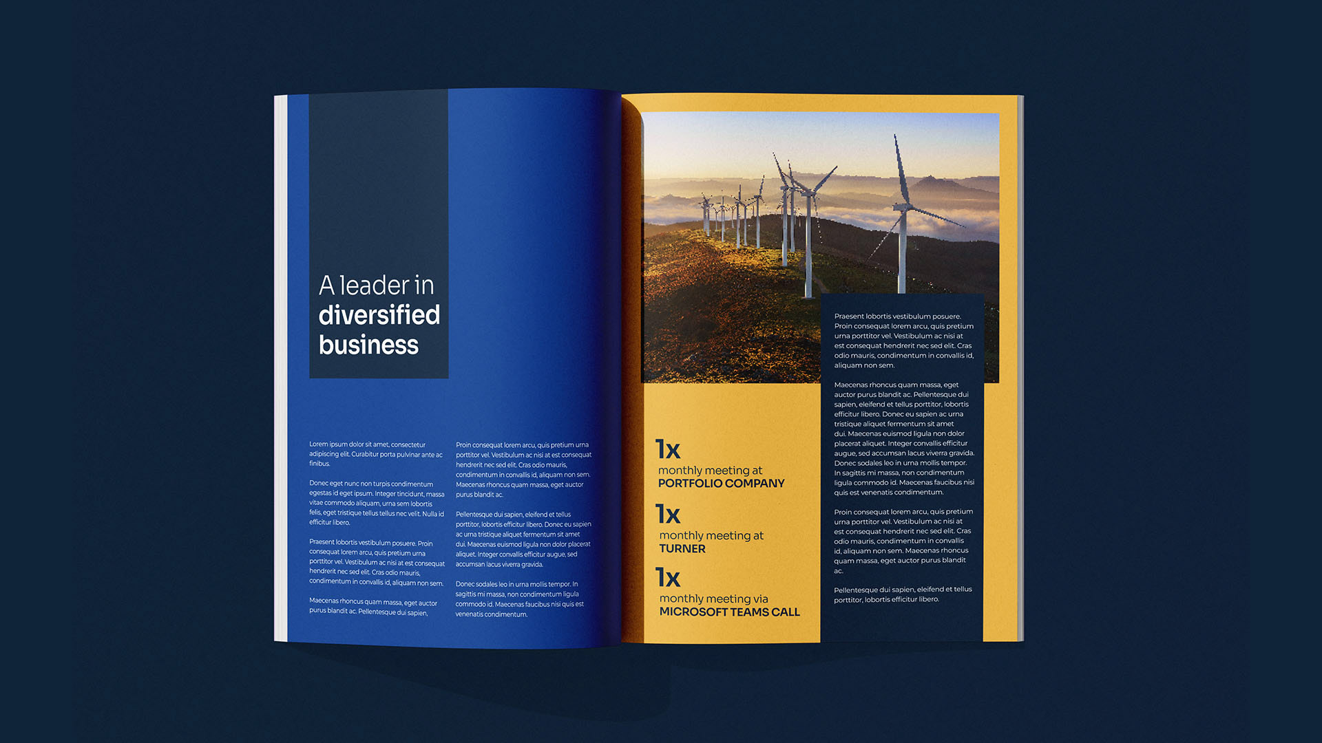
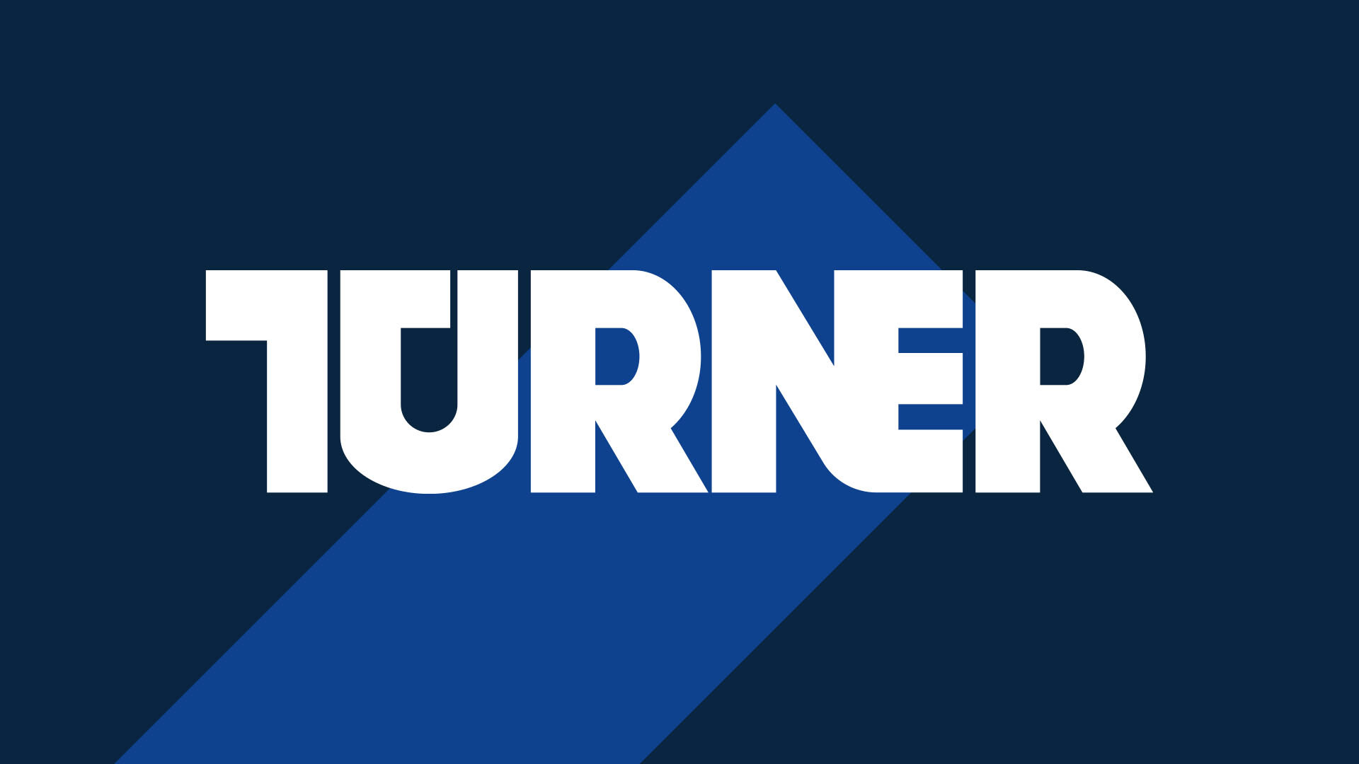
The biggest change to the existing brand was the introduction of a new brand font, Sora. It's structured letter forms look sleek and contemporary echoing Turner & Co's new ambitions. The colour palette was developed around their heritage green with new blues and yellow.
The refresh also introduced a block rectangle as Turner & Co 's new brand system. Geometric shapes reflect structure, stability and order. Alongside the colours and font, the block helps bring their story to life and showcase what Turner & Co have to offer.
Created at BIG Partnership